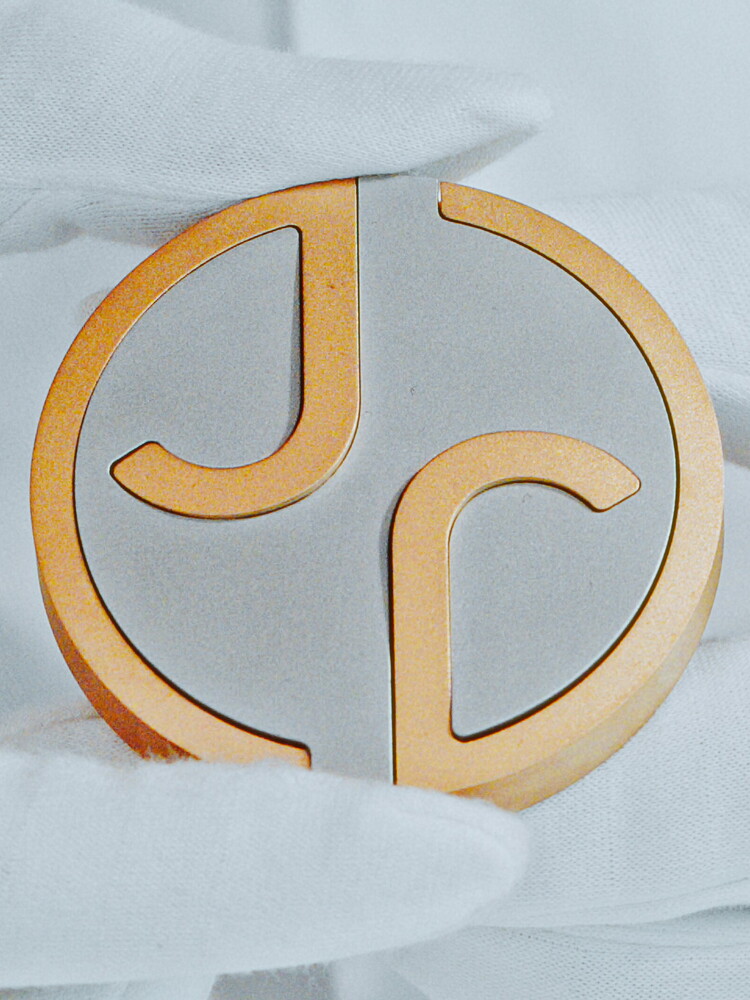
A circle with two “J”s facing oppositely. This is the new emblem of Jaguar, which retires one of the most famous logos in the history of motoring, the prancing jaguar, created in 1945 by William Lyons, founder of the brand. A drastic change that accompanies the car manufacturer’s conversion to electric and the launch, scheduled for 2026, of a new range that will profoundly innovate the shapes and performance of the English manufacturer’s products.
Taking the place of the ‘leaper’ or ‘growler’, as the old logo was called by enthusiasts and professionals, will also be, more simply, the word ‘Jaguar’, written in gold with a minimal minimal font on a grid white, recalling a past that is the history of four wheels. In this “colourful and original modernist exuberance”, as stated in the company’s press note, there will still be a place for the good old feline, although no longer on the bonnet or in the symbol. The designers explain that the jaguar will be used as an “expressive code and sign of a completed work” but to understand which elements it will mark we will have to wait until December 23rd, when Jaguar will present its first concept car in Miami. However, it will no longer be the traditional ‘leaper’ that jumps from right to left but will run from left to right, against a background of horizontal lines, a sign of a brand projected towards the future and a younger and more demanding clientele.
